
Infographic design
that helps your business Get noticed.
Our designers work with you to create professional infographics for your reports and marketing.
What is an infographic?
Infographics are a smart way to present data or information in a way that’s easy to digest and visually appealing.
We transform your content into designs that are on-brand and easy to understand.
Still not sure what an infographic is? Click here for a visual example!
Got info that needs simplifying?
Let’s chat about how an infographic could help.
Why choose Synergy Graphics for professional infographic design.
We help your audience understand faster and remember longer.
✔ Custom designed for your message and audience
✔ Perfect for reports, social media, websites and presentations
✔ Tailored to your brand’s look and feel
✔ Visual hierarchy that makes content flow naturally
Infographics are information with impact, designed for fast readability, clarity, not clutter.


Why this satisfied client chose Synergy Graphics:
Synergy Graphics has been incredibly easy to deal with from start to finish.
Their communication is clear, prompt, and professional, and they truly understood what I needed.
The quality of their work is excellent — the design they created is absolutely fabulous and exceeded my expectations.
Highly recommend them to anyone looking for top-notch design and a smooth, stress-free process!
Sarah Taylor
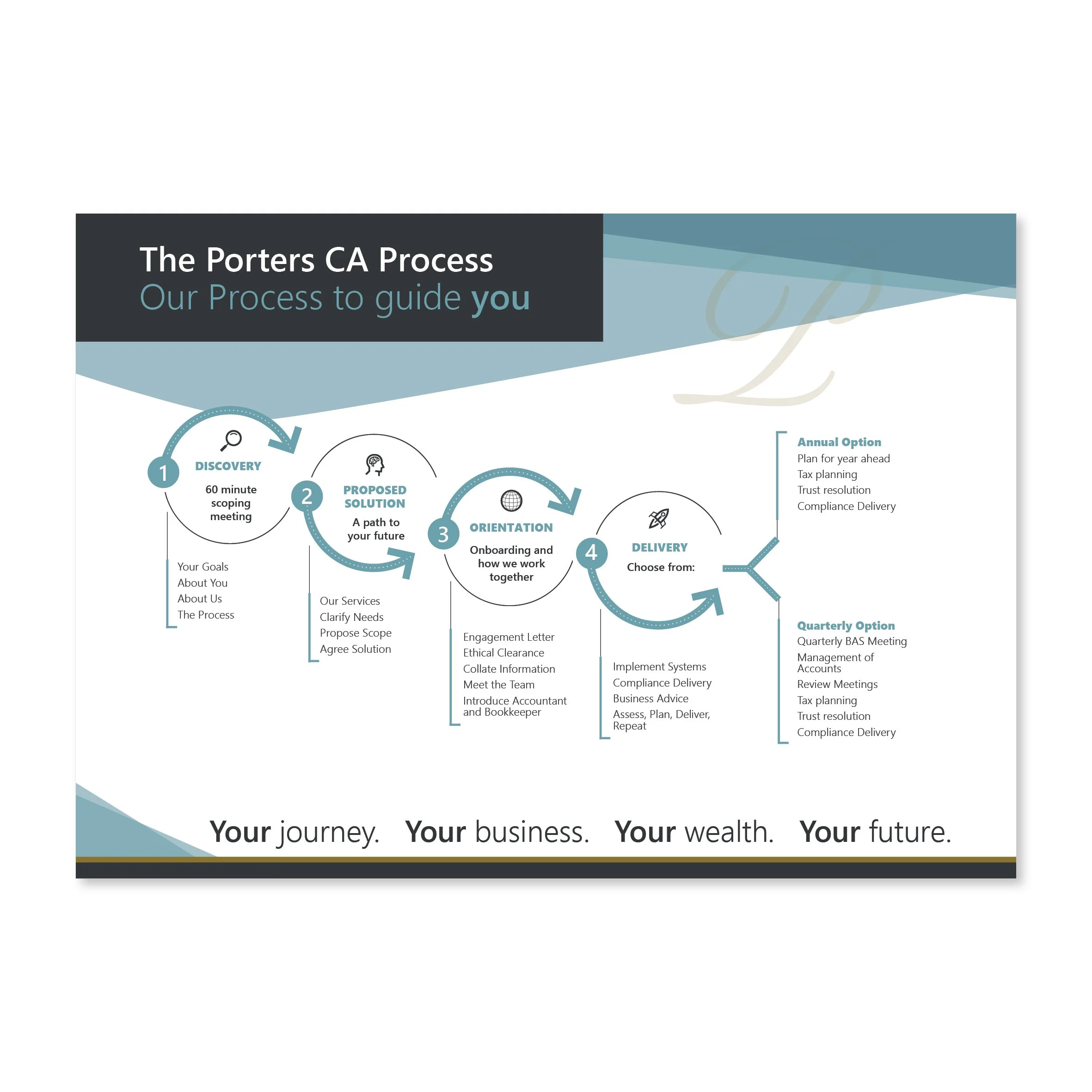
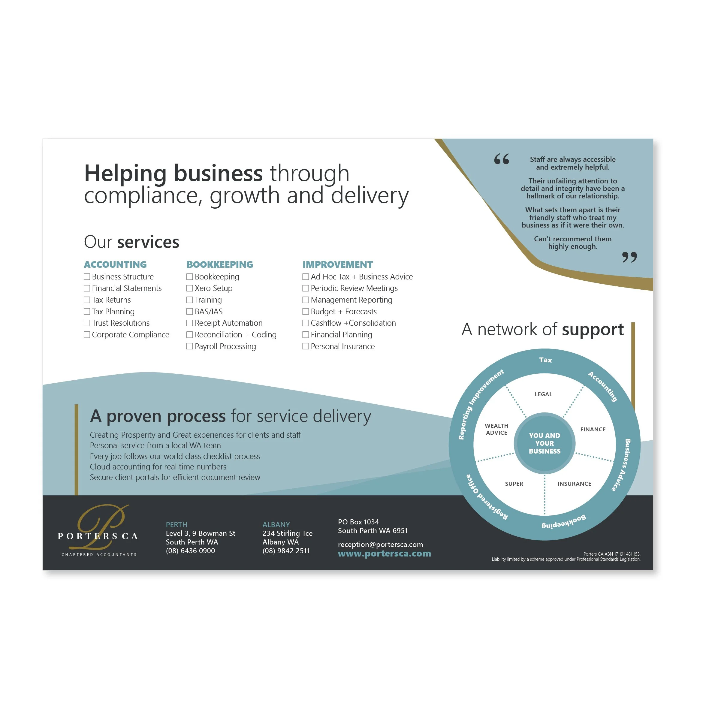
Infographic Design Examples
Explore our infographic examples, from stats-driven reports to illustrated explainer graphics.
FAQs.
-
Clear, focused content presented with engaging visuals.
It should simplify complex information, not overload it.
-
They’re great for reports, social media, presentations, websites -anywhere you want to explain something visually.
-
We sure can!
Simply provide your stats or content, and we’ll turn it into something eye-catching and easy to understand.
-
We can easily design for both!
We can supply high-res print versions and optimised digital files for web or social media use.
there are no stupid questions…
Infographic Design Process.
in summary…
We aim to make our infographic design service as stress-free as possible, with clear processes, collaboration and transparency:
Discovery & Brief – We review your content, audience and objectives of the infographic.
Costings and Payment Options – Once we have determined your requirements, we will send a quote with optional print pricing and flexible payment options. On acceptance of the quote, we send your deposit invoice.
Concept Development – On receipt of your deposit, we will get started! We create a visual layout, choosing icons, graphs, and illustrations to suit, and present them for feedback.
Refinement – You provide feedback to us and we fine-tune the artwork until it’s spot-on.
Final Delivery – Once you’re happy, we’ll supply print-ready and web-ready files.
More ways to Get noticed.
A strong brand doesn’t stop at infographics. We design everything from print and signage to supporting marketing materials… so your business gets noticed in more ways.
-

Unique, custom branded icons designed to bring consistency and personality to your brand.
-

Enhance your projects with custom illustrations. Unique visuals to elevate your brand and engage your audience.
-
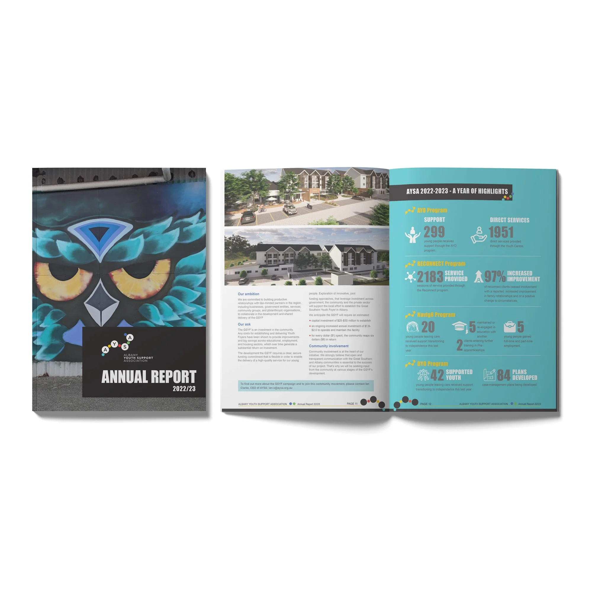
Visually appealing AND easy to read Annual Reports that people actually want to read... What a novel idea!
-
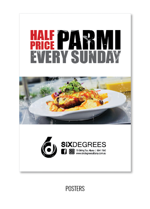
Posters designed to grab attention while communicating your message clearly and staying on brand.
-
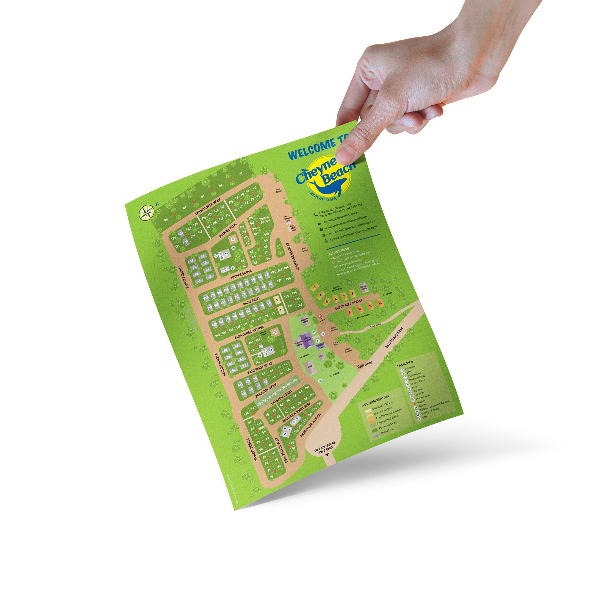
Have your property digitally illustrated to clearly display what you need to in a casual, fun way.
What is an infographic and why/when would I use them?
Great question!
An infographic is a picture that helps explain something. It uses a mix of words, icons, and images to show information in a way that’s easy to understand. Instead of lots of text, it gives people the key points quickly and clearly.
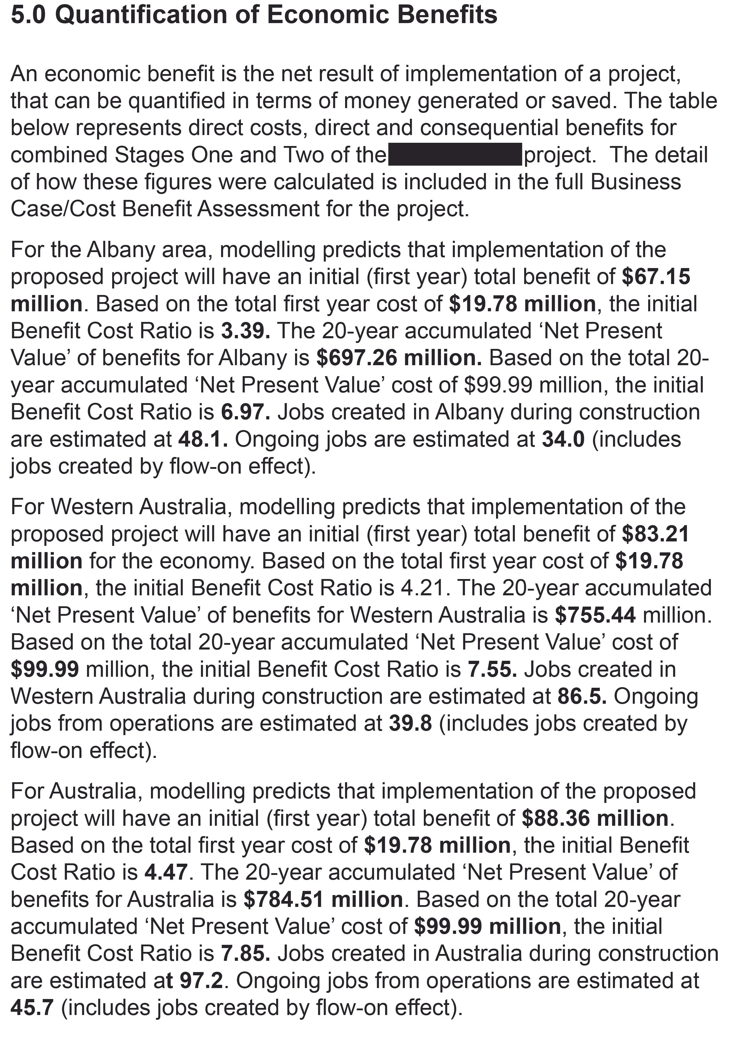
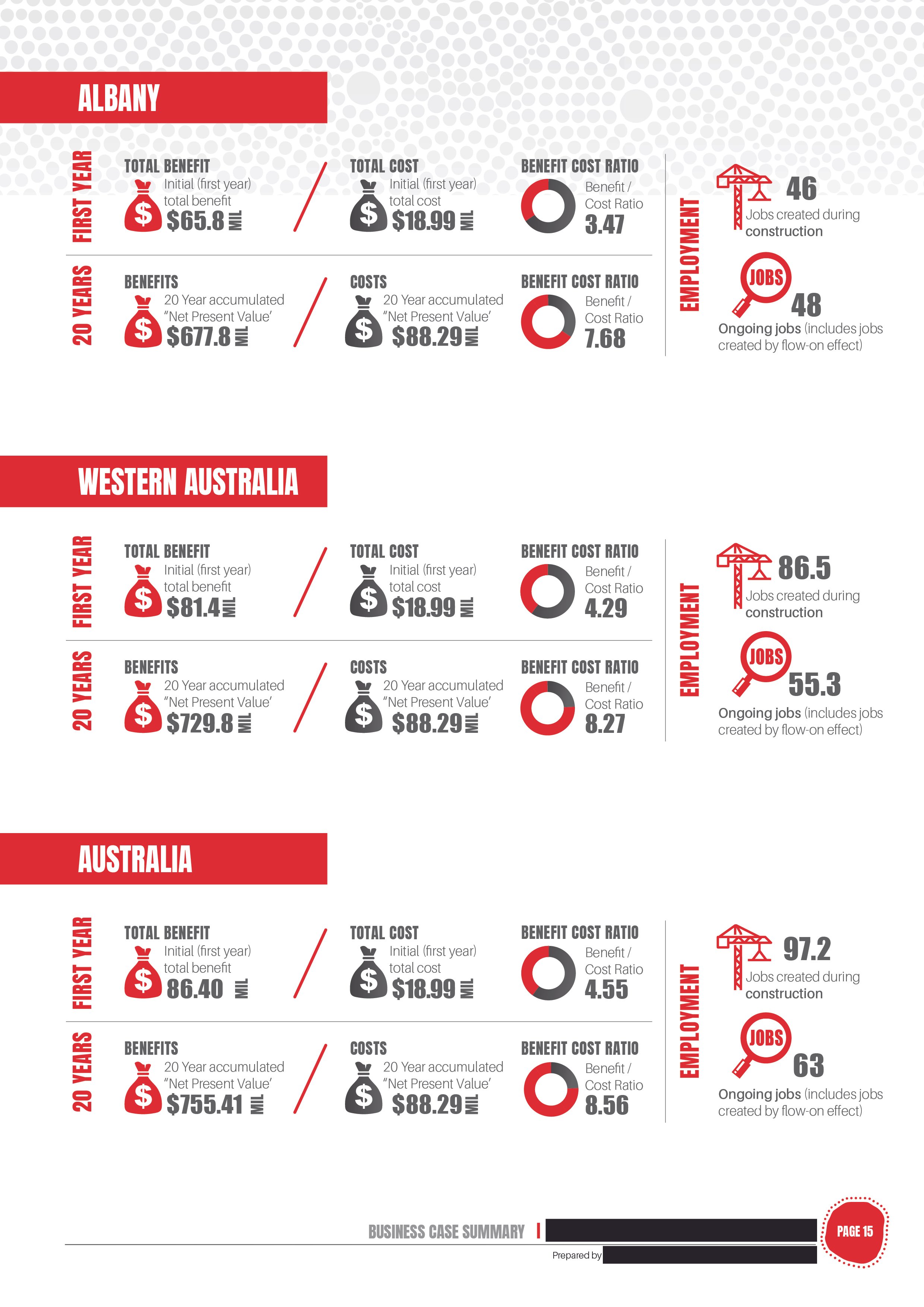
To give an example, we were working on the design of a Business Case Report and came to this page: Quantification of Economic Benefits.
I don’t know about you but my brain hurts already! This page is full of text and figures, Benefit Cost Ratios to be exact. (Yep, nap time!)
We could have easily just formatted this text and gone on to the next page, but I ultimately wanted the readers to be able to understand it.
So we broke the information down into sections, then displayed the figures in a large font, combined with icons and pie charts.
Yes, there is still a lot of information, but now it is easy to read and breakdown categories and items. We refer to these as info graphics.
Still exploring?
Head back to our full range of services and browse more options.